Representing the 50th
Student contributors share the inspiration behind
their 50th logo designs in honour of UWCSEA’s golden jubilee.


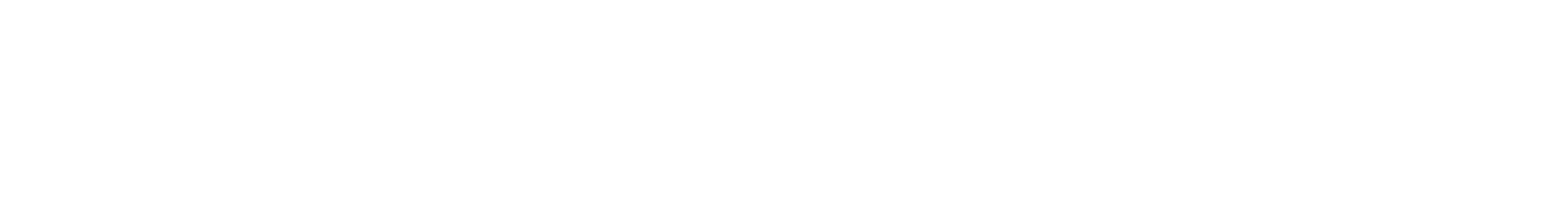
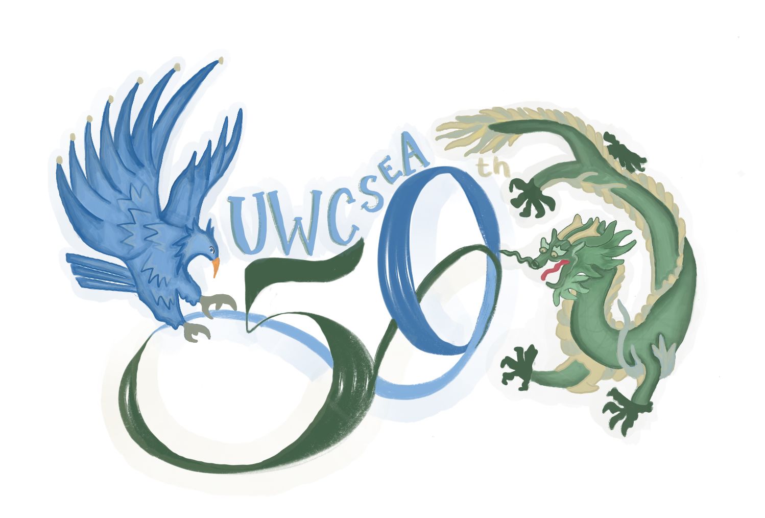
Because of the 50th Anniversary of UWCSEA, I used 5 and 0 balloons which contain the colours of UWCSEA. 'U' stands for Dover Phoenix. 'W' stands for Academic in the UWCSEA values, so I drew books. 'C' stands for the world because it is United World College, which means UWCSEA students can change the world in better ways. Also, C is round-shaped so I used C for the globe. 'S' stands for social and service. Two people there with different skin colours, are socialising and understanding each other. Also the colour yellow means brightness, and happiness. 'E' stands for East Dragons and their colour. 'A' stands for woods and it represents sustainability and outdoors. Overall the style I used for this design is simple, but intense, and round-shaped design.
– Harang Choi, Dover, Epiphany, Grade 7

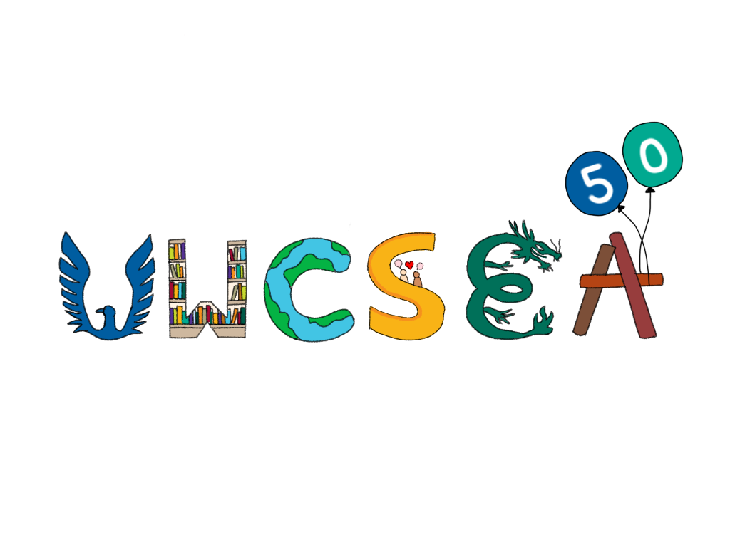
My design was inspired by this year's theme of "celebrating our past and looking into the future" hence, I made each letter represent a part of what we have achieved as a community this year and what we continue to strive for as a student, teacher and staff body. As a student since junior school at UWCSEA, I have had the opportunity to take in the principles of the school and my inspiration came from my experiences at the school. I wanted to show what UWCSEA's mission and values are so I used symbols that represent sustainability, teamwork and friendships, and a global and inclusive community.
– Sarah Ahmed, Dover, Epiphany, Grade 10


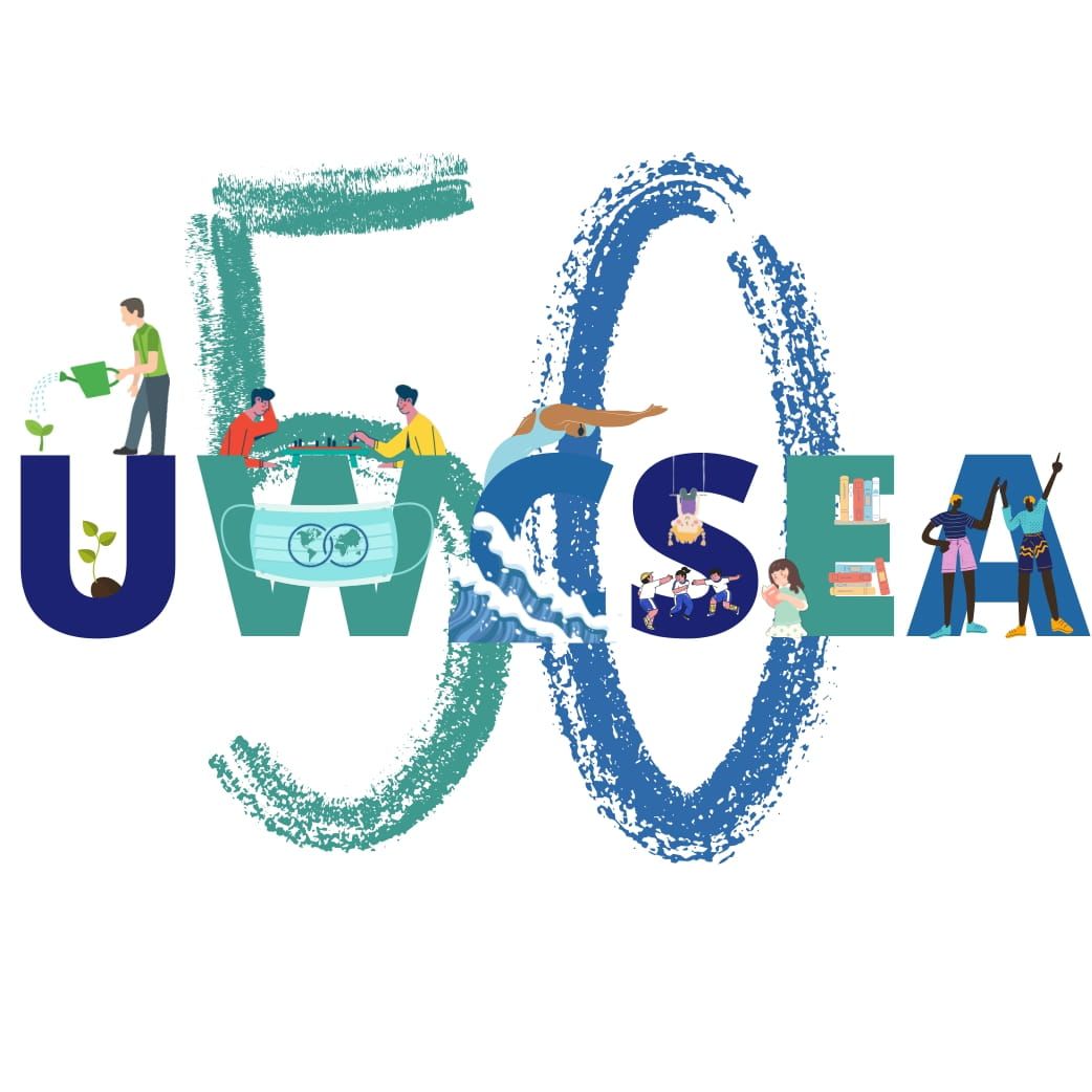
As UWC is more about uniting students and showing the significance of positive impact that our community can make, the people with variations in hairstyles and skin that can represent diversity were chosen to be presented. To prevent controversies on people’s look on the logo, we decided to exclude having specific faces on the logo. In order to demonstrate UWC’s inclusive community, the two globes from the UWC logo came to form a heart. Overall, keeping a simple design, we believe that we were able to demonstrate the uniting, inclusive, learning, and diverse community of UWC.
– Jiayu Fu and Bomin Kim, East, Graphic Design, Grade 10

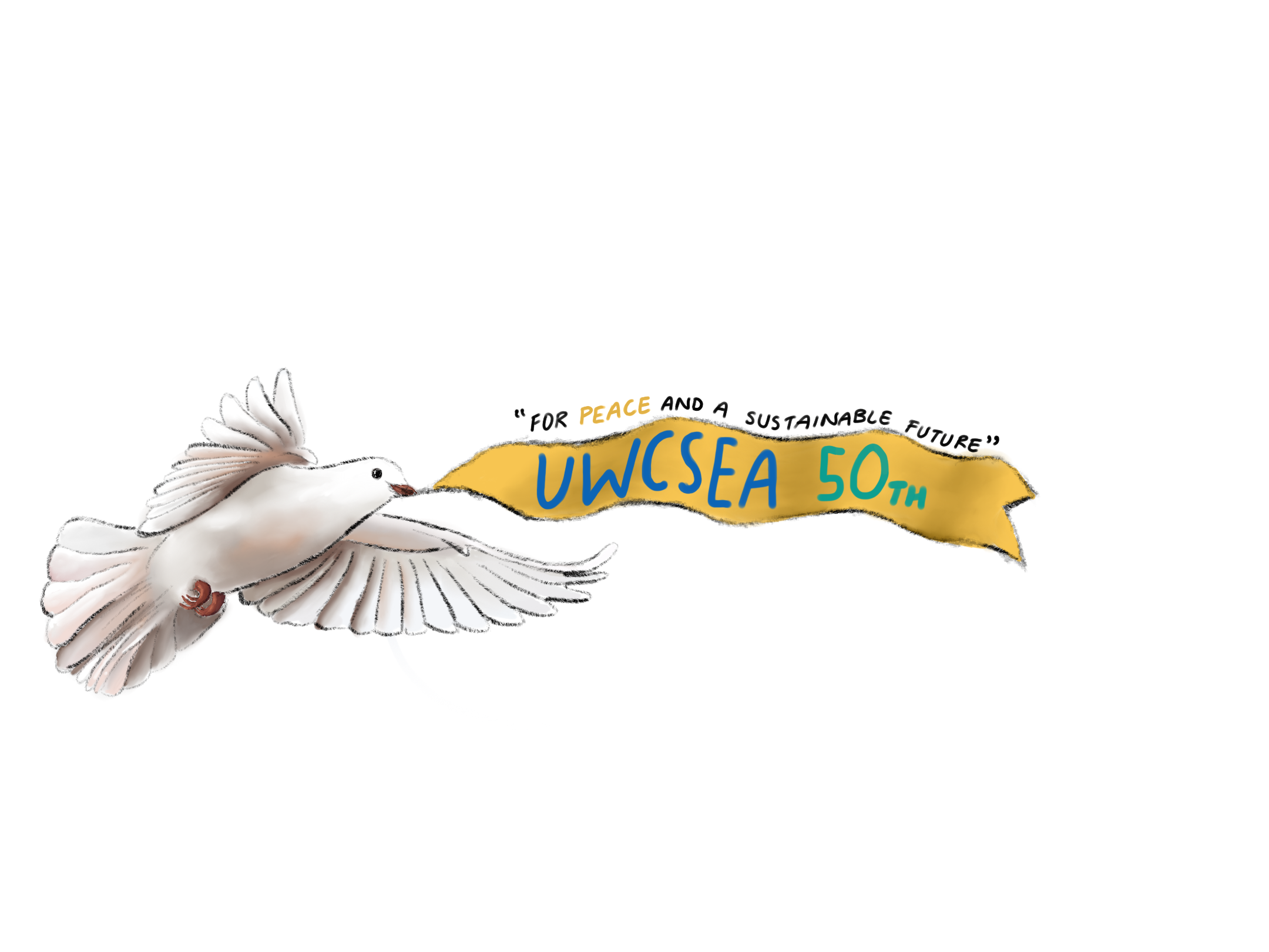
When I think of peace – the theme of UWCSEA’s 50th anniversary – a symbol of a dove is the first thing that comes to mind. I decided to illustrate a dove carrying a banner representing our school and its motto for “peace and a sustainable future” as it is an international and well recognised symbol for a messenger of peace, unity and justice which are values we strive to spread at UWCSEA. Just like a dove reaching new heights, the UWCSEA movement has overcome many frontiers since it was first established, and together we have so much more to accomplish as a community – the sky’s the limit!
– Shruti Pataballa, East, Grade 10


When designing my logo I was focusing on the sustainability theme, hence the sprout. However, I also wanted to represent that UWCSEA is constantly growing and developing as a school. The other symbols such as the paper chain, handshake, and globe are meant to show our inclusive and diverse community from all over the world.
– Aanya Agrawal, Dover, Epiphany, Grade 10

The logo represents the history of Singapore with UWCSEA. Incorporating the colours of the College and earth, the logo connects the flag in the image to the universal global movement of UWCSEA.
– Hyomin Kim, Dover, Epiphany, Grade 11

When designing this logo, I focused on the impression it would give. I wanted to show the school’s true colours and hoped to encapsulate the experience on campus.
– Lawrence A., Dover, Epiphany, Grade 11


As we celebrate the 50th Anniversary of the UWCSEA movement, we are reminded of its message of peace, inclusivity and unity. In this logo, the combination of the UWCSEA 50 symbol and the olive branches, the movement and core mission is resonated – through the use of education, we can make our future generation the changemakers and peacemakers of the world. The MUN community at UWCSEA has worked tirelessly towards this goal and will continue to develop changemakers to build a better world.
– Aayush G., East, MUN Executive Committee, Grade 11
As I designed this logo, I wanted to first focus on the simplicity of the logo, while effectively communicating the celebratory theme that would be suitable for the 50th year. For the number '50' right at the centre of the logo, I wanted to arrange the 0, adding the globe on one side to represent the multicultural community and identity we have at UWCSEA. The navy ribbon surrounding symbolises this annual event, as ribbons are often used for celebratory purposes, with the leaf/feather-like framings surrounding the logo embody unity, peace and freedom of the community.
– Seika K., Dover, Epiphany, Grade 12

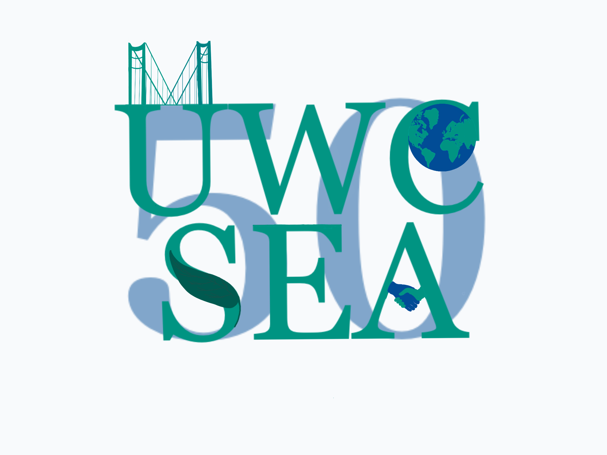
For this logo I wanted to focus on UWCSEA’s ability to unite people and build bridges among peers. UWC is a global movement centred in innovation, sustainability and equality which I represented through the use of symbols such as the globe, a bridge, a leaf and a handshake. The 50th anniversary celebration is a time to remember UWC values and apply them to life improving connections, celebrating differences and taking care of the environment through initiative.
– Melis A., Dover, Epiphany, Grade 12